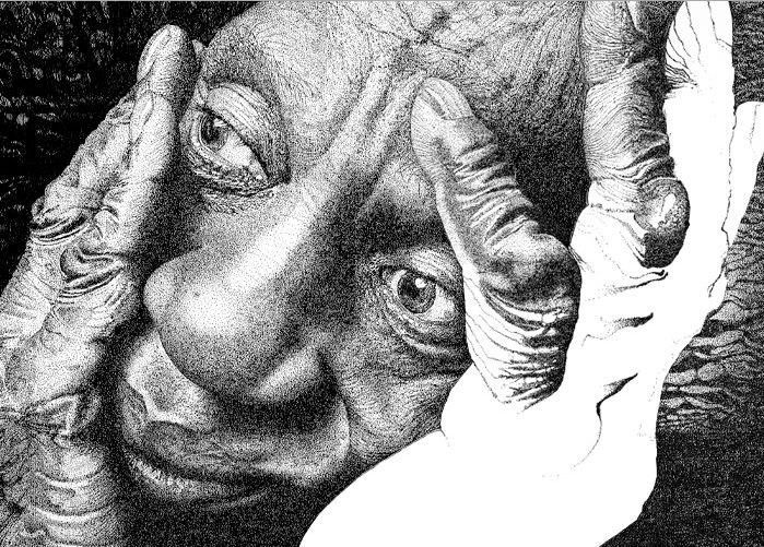
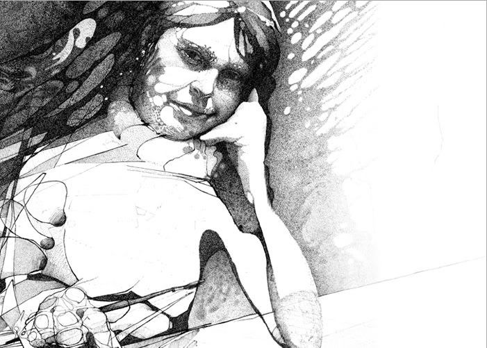
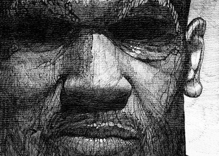
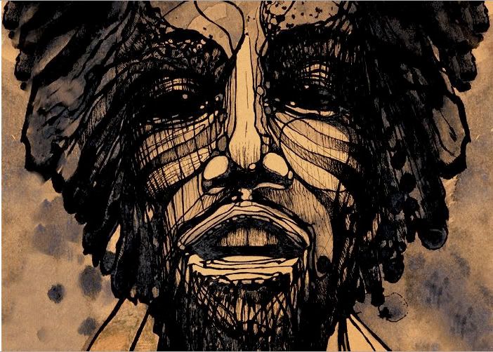
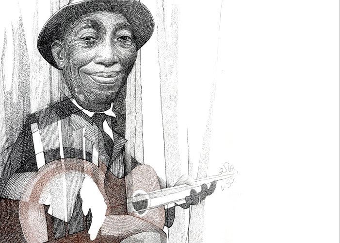
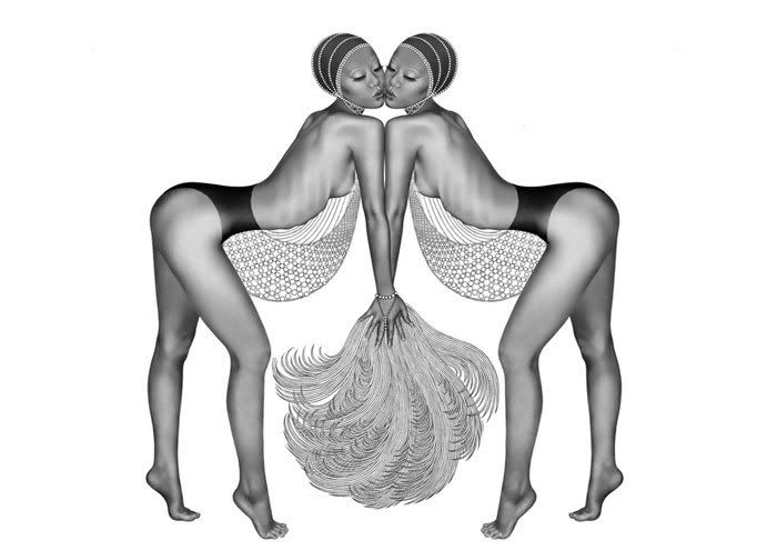
Aaron Baggio's work is caught somewhere between abstraction and realism. One traditional pen and ink technique involves successive dots to build up darker tones. Baggio creates grainy textures and unexpected patterns in his pen and ink portraits using watercolors, acrylics, intricate line work, and digital assistance.
Sunday, March 22, 2009
Aaron Baggio
Aaron Baggio's work is caught somewhere between abstraction and realism. One traditional pen and ink technique involves successive dots to build up darker tones. Baggio creates grainy textures and unexpected patterns in his pen and ink portraits using watercolors, acrylics, intricate line work, and digital assistance.
Labels:
Aaron Baggio,
abstract,
illustration,
pen and ink,
realism
Thursday, March 19, 2009
JR
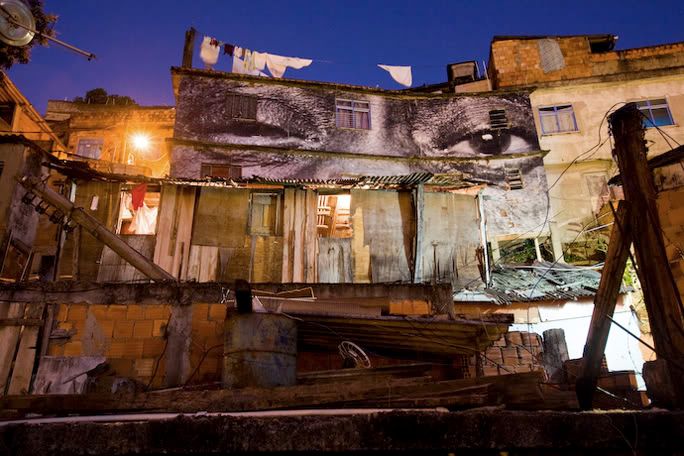
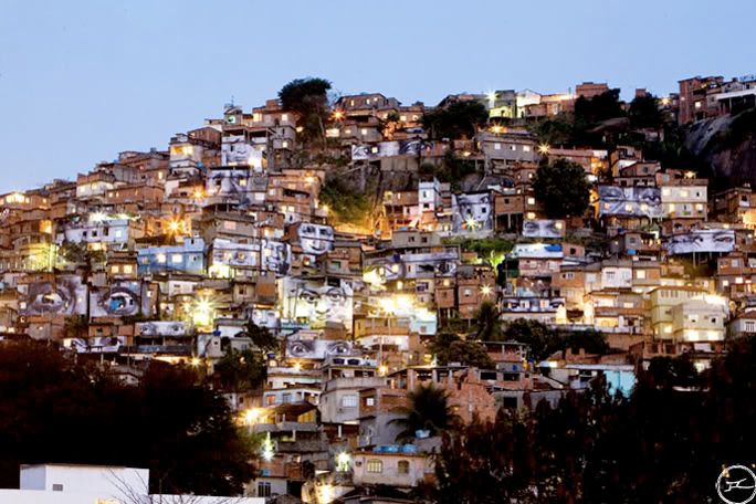
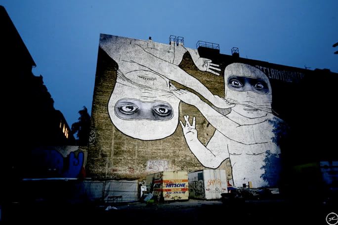
French photographer JR has spent the year taking portraits of victimized women in Africa, Asia, and South America, then making massive, poster-size prints, which he plasters illegally in places you'd least expect—on buildings, bridges, buses, and beyond. The idea, says JR, who doesn't give his full name in case he's prosecuted, is to celebrate the strength and courage of women who live in places where they are often targets in wartime—and discriminated against in times of peace.
Wednesday, February 25, 2009
Shinichi Maruyama
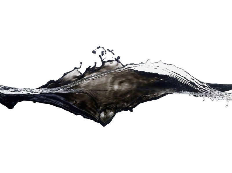
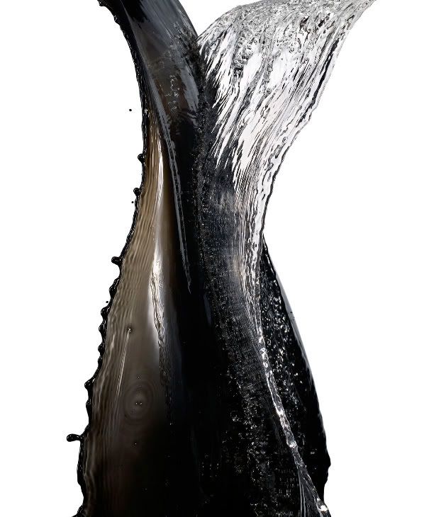
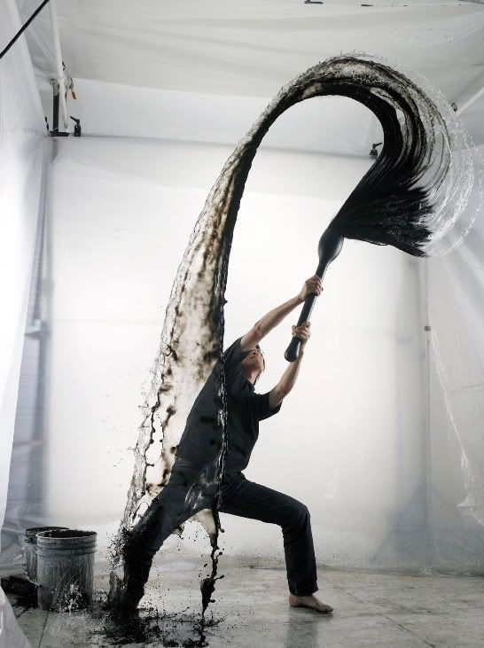
Following in the footsteps of stop motion scientist Harold Edgerton, Japanese photographer Shinichi Maruyama uses high tech strobe lights to make exposures in one 7500th of a second. Maruyama uses these new tools to make expressive images of colliding waves of black ink and water, caught in mid air against white backgrounds. His pictures capture the gestural qualities of the drips, splashes, washes and sprays, in the split second before they merge into a muddy puddle. The resulting abstract swirls are clearly reminiscent of Japanese calligraphy and ink drawing, but with an undertone of energetic chaos.
Sunday, February 22, 2009
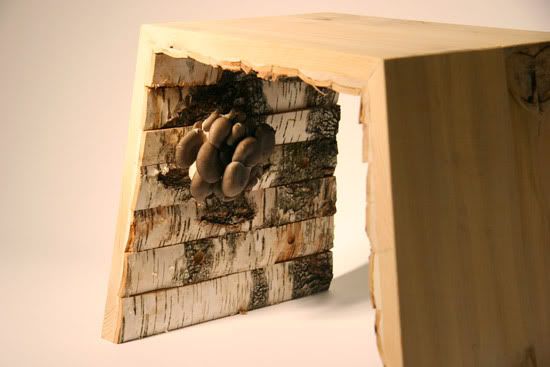
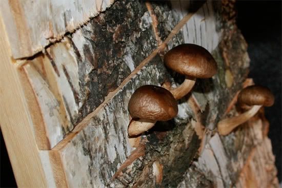
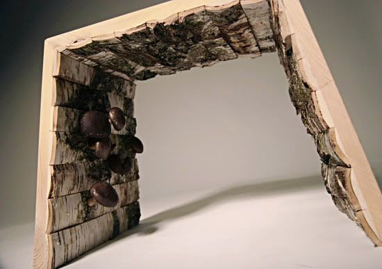
'Mushrooms Ate My Furniture' by Shinwei Rhoda Yen
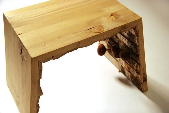
'Mushrooms Ate My Furniture' by designer Shinwei Rhoda Yen is a piece of garden furniture made with natural wood and embedded with mushrooms' spawn. After a time of exposure to the weather, mushrooms will grow live on the furniture. As the nutritional material from the wood is eaten by the mushrooms, the furniture will start to break down, eventually decomposing.
Friday, February 20, 2009
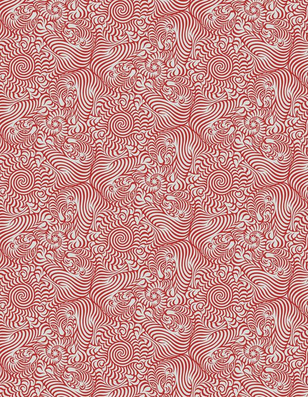
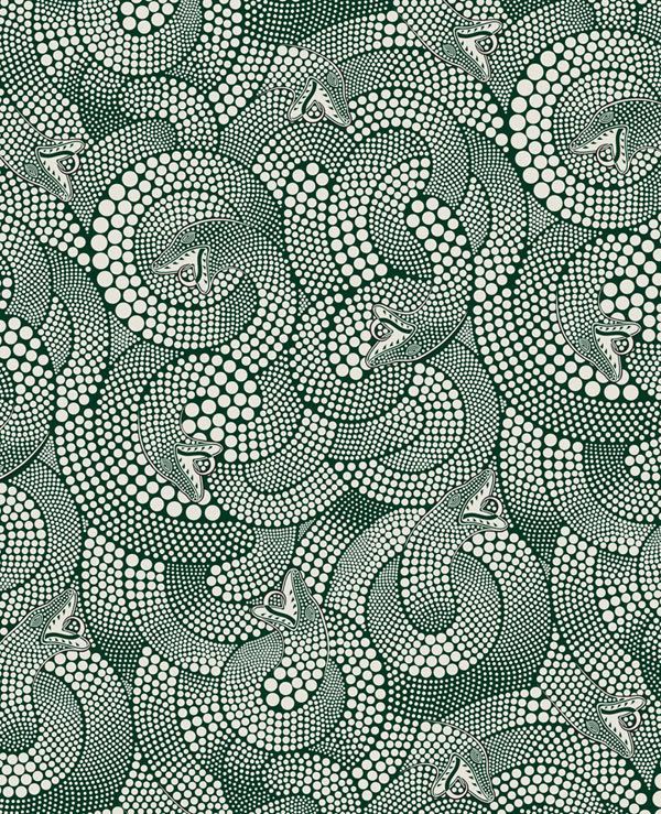
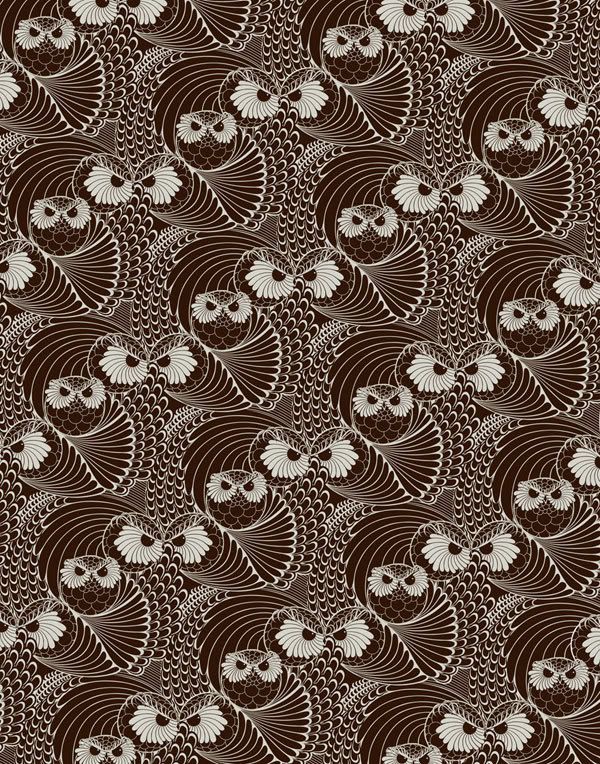
Yehrin Tong
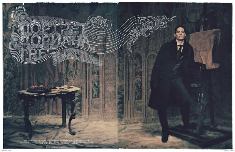
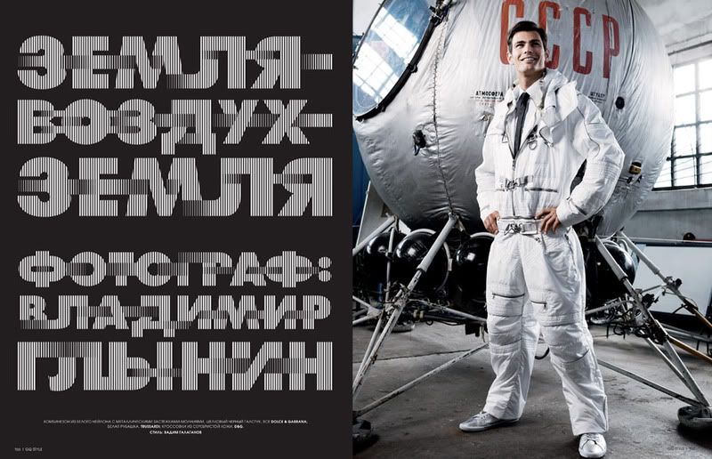
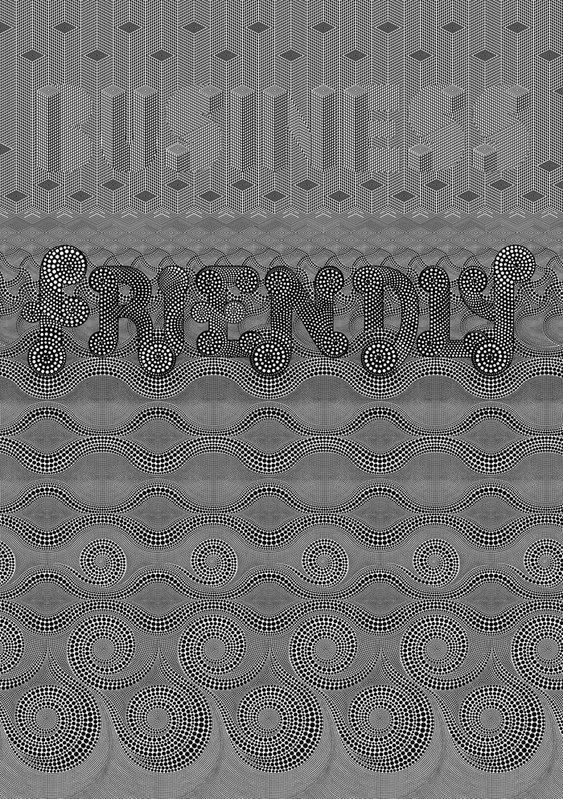
Yehrin Tong is an illustrator currently working in central London. Her work appears in everything from editorial to album covers to clothing (Maharishi's SS08 line). Rarely using more than one color, her illustrations are bold, rich in geometric repeat textures, and hyper realistic. Her typographic work evokes a lot of movement. Tong works mainly in Illustrator and Photoshop using a Wacom tablet to achieve a freehand quality. Her hard drive has become her sketchbook.
Fashion is a huge influence on her work. For example, beading and needlework in clothes is a meticulous element that Tong shows clear appreciation for. Tong says, "I try to produce illustrations that people would want to possess, in the same way you'd want to own a beautiful piece of jewellery. I think, 'how would this type look if I wore it?' Or 'how would that dress detail work on my typeface?' For figurative work, I look to dance for ideas; I find dancers in flight particularly transfixing. It translates to typographical work too, giving it a more emotive edge. In terms of subject matter, drama, strength, beauty and sexuality - I want them all coming across in my pictures."
On the subject of what she enjoys working on the most, Tong says, "It would have to be any one of the fabric patterns - I really enjoy designing them. It's a very nerdy thing to enjoy but I love the puzzle-solving element to some of the more complex ones. I'm a big fan of puzzles in general and maths equations etc. I'm not saying I've solved Fermat's Last Theorem or anything but the idea of problem-solving, motifs, perfection and order within chaos are all things I hope people can spot in my work. There's nothing more satisfying than when a pattern slots together perfectly and appears balanced and cohesive."
Labels:
fashion,
fonts,
graphic design,
illustration,
typography
Tuesday, January 6, 2009
Chris Ware
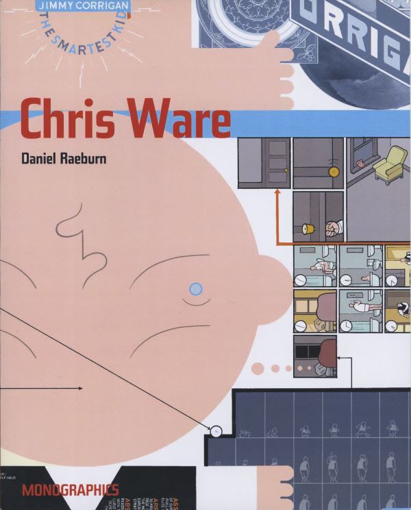
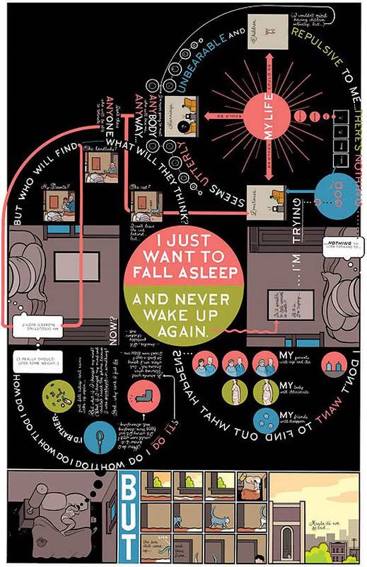
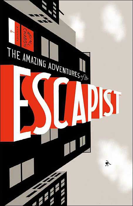
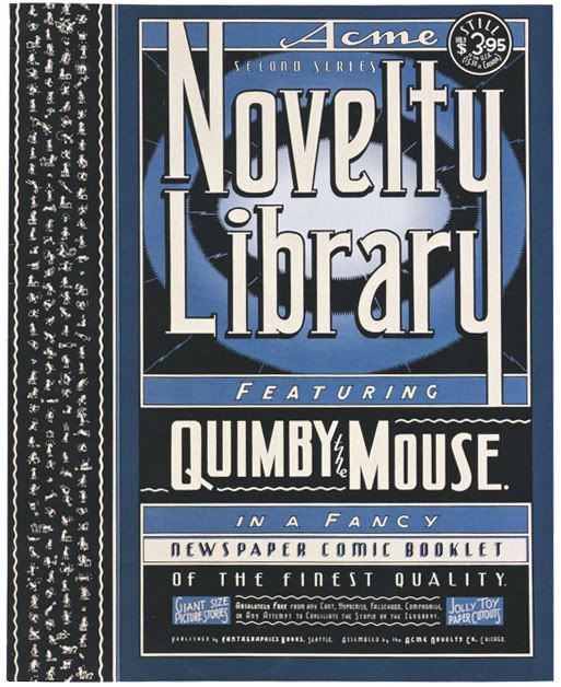
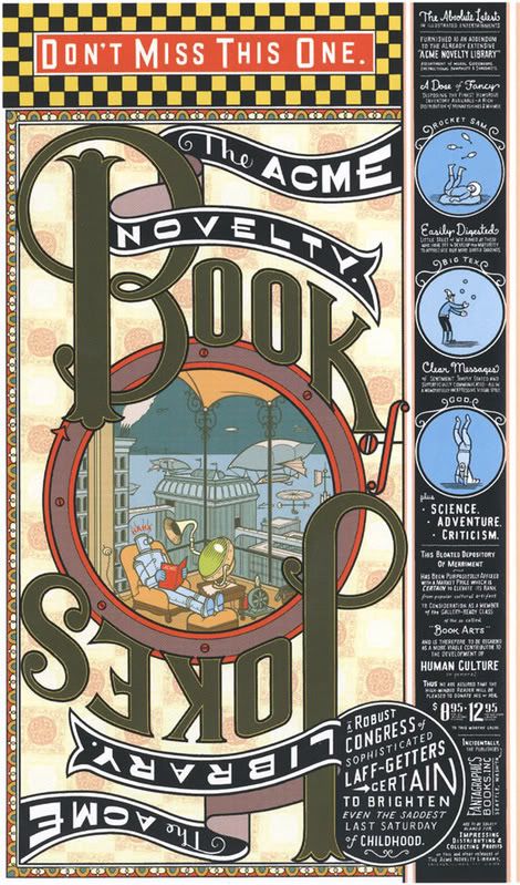
Chris Ware is an American comic book artist and cartoonist, best-known for a series of comics called the Acme Novelty Library, and a graphic novel, Jimmy Corrigan, the Smartest Kid on Earth. Born in Omaha, Nebraska, he resides in Oak Park, Illinois as of 2007. Combining innovative comic book art, hand lettering, and graphic design, Ware’s uniquely appealing work is characterized by ceaseless experimentation with narrative and graphic forms.
Ware introduced the character Jimmy Corrigan in a full-page strip he began writing for the Chicago tabloid New City. Combining six years’ worth of the strips, Ware created the best-selling novel named after Jimmy that spans an Irish-American family’s life in Chicago from the Civil War to the present. For its experiments in graphic form—including pull-out, three-dimensional inserts—and its non-chronological narrative, the novel earned numerous honors, among them the Guardian First Book Award, presented for the first time to a comic book.
At first glance his detailed geometrical layouts look like they were computer-generated using Adobe Illustrator but Ware works is almost exclusively by hand using t-squares, pencils, and rulers. He only uses a computer to apply color.


Ware introduced the character Jimmy Corrigan in a full-page strip he began writing for the Chicago tabloid New City. Combining six years’ worth of the strips, Ware created the best-selling novel named after Jimmy that spans an Irish-American family’s life in Chicago from the Civil War to the present. For its experiments in graphic form—including pull-out, three-dimensional inserts—and its non-chronological narrative, the novel earned numerous honors, among them the Guardian First Book Award, presented for the first time to a comic book.
At first glance his detailed geometrical layouts look like they were computer-generated using Adobe Illustrator but Ware works is almost exclusively by hand using t-squares, pencils, and rulers. He only uses a computer to apply color.
Wednesday, December 10, 2008
John Gall Book Covers
In today's publishing world, individuality is as quaint a term as dust jacket. Not so for art director John Gall, who brings an original and idiosyncratic design sense to his work for the Knopf Group. Gall’s stylish sensibility, simple but elegant use of typography and quietly rebellious spirit infuse these literary works with an added dimension. Subtle and compelling, his covers play with the perceptions of the viewer in unexpected ways, and to satisfying effect. Scanning the table of trade paperbacks at the local bookseller, one would have no difficulty spotting Gall’s distinctive and visually articulate work.
Aside from having a beautiful cover, A General Theory of Love is an amazing book.


Aside from having a beautiful cover, A General Theory of Love is an amazing book.
Labels:
books,
covers,
graphic design,
Knopf,
layout,
photography,
Random House
Subscribe to:
Posts (Atom)