Yehrin Tong
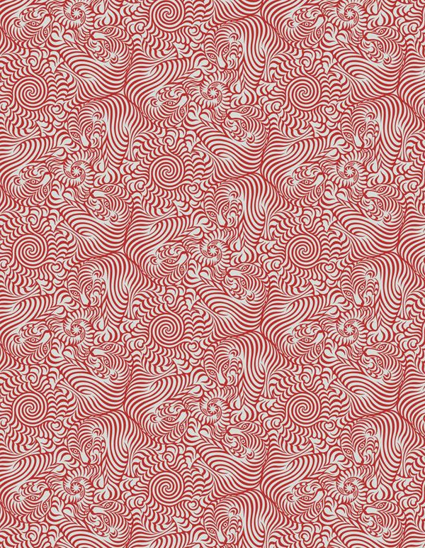
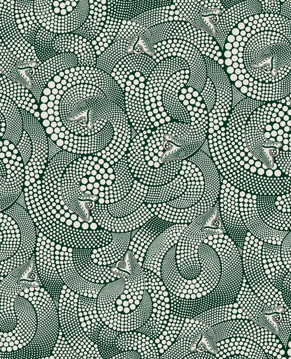
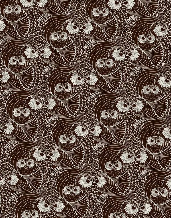
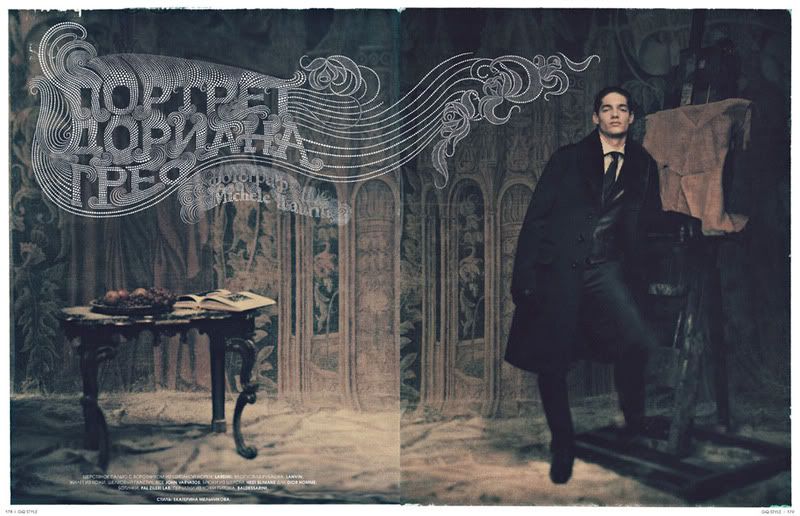
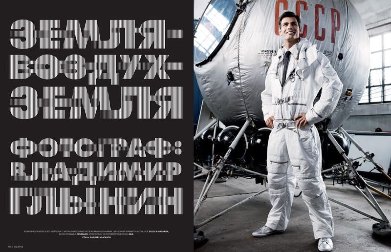
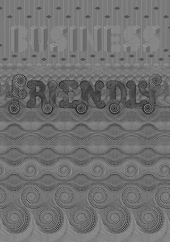
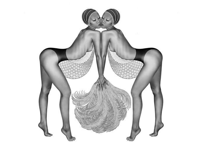
is an illustrator currently working in central London. Her work appears in everything from editorial to album covers to clothing (Maharishi's SS08 line). Rarely using more than one color, her illustrations are bold, rich in geometric repeat textures, and hyper realistic. Her typographic work evokes a lot of movement. Tong works mainly in Illustrator and Photoshop using a Wacom tablet to achieve a freehand quality. Her hard drive has become her sketchbook.
Fashion is a huge influence on her work. For example, beading and needlework in clothes is a meticulous element that Tong shows clear appreciation for. Tong says, "I try to produce illustrations that people would want to possess, in the same way you'd want to own a beautiful piece of jewellery. I think, 'how would this type look if I wore it?' Or 'how would that dress detail work on my typeface?' For figurative work, I look to dance for ideas; I find dancers in flight particularly transfixing. It translates to typographical work too, giving it a more emotive edge. In terms of subject matter, drama, strength, beauty and sexuality - I want them all coming across in my pictures."
On the subject of what she enjoys working on the most, Tong says, "It would have to be any one of the fabric patterns - I really enjoy designing them. It's a very nerdy thing to enjoy but I love the puzzle-solving element to some of the more complex ones. I'm a big fan of puzzles in general and maths equations etc. I'm not saying I've solved Fermat's Last Theorem or anything but the idea of problem-solving, motifs, perfection and order within chaos are all things I hope people can spot in my work. There's nothing more satisfying than when a pattern slots together perfectly and appears balanced and cohesive."